WATCH IT!
Written Content
Web Accessibility Tool and Checklist:
Implementation and Tips
WHAT?
Screen reader is a tool designed to verbally articulate the content displayed on the screen. When getting started with a screen reader, users must become familiar with certain keyboard shortcuts since it does not rely on the use of mouse.
WHY?
For persons who are blind or with low vision, screen readers are main tools to access webpage content.
HOW?
Test created content and make sure that data available for graphs, charts, maps, SVGs etc. is also readable by screen readers.
TIP: Some examples of useful free of charge tools to test content accessibility are Screen Reader and NVDA.
WHAT?
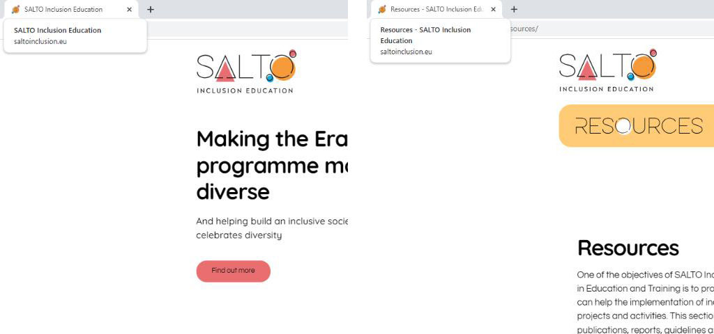
Web page title is a short description of a webpage that appears in the tab of a browser window.
WHY?
The title is typically the first content read by screen readers when the page is loaded.
HOW?
Think of a short title for every page that describes the page content and distinguish it from other pages (the page title is usually the same as the main heading of the page). The unique and most relevant information should be first (for example, put the name of the page before the name of the organisation). Web developers should have knowledge and skills to add page titles when creating a website.

WHAT?
Headings and subheadings show up at the top of paragraphs of text as their titles and provide an idea of what paragraphs are about.
WHY?
When headings are clear and descriptive, users can find the information they seek and understand the relationships between different parts of the content more easily.
HOW?
Use short headings to group related paragraphs and clearly describe the sections. Good headings provide an outline of the content.

WHAT?
Content should be both brief and comprehensive, written in short sentences and paragraphs.
WHY?
Clear and concise content helps persons with reading difficulties, as well as persons with differing abilities that make it difficult for them to understand non-literal word usage, specialised words or usage of figurative language.
HOW?
- · Use simple and easy-to-understand language rather than complex words and phrases.
- · Use full name in the first mentioning and put abbreviation/acronym in the brackets. For example, SALTO Resource Centre for Inclusion and Diversity in Education and Training (SALTO ID ET).
- · Provide a glossary of lesser-known terms.
- · If necessary, use images, illustrations, video, audio or symbols to make content easier to understand.
- · Use simple formatting, as appropriate for the context (e.g., list formatting).
WHAT?
Hyperlinked text is a word or a phrase on a web page which is visually noticeable and which directs users to other pages within the same site or on external sites.
WHY?
Meaningful text in links is essential for users of assistive technology like screen readers and speech recognition software. Screen readers often list links, allowing users to instruct which link to open, emphasising the importance of meaningful text. Additionally, using underlines can assist colourblind and technologically less experienced users in recognising and interacting with links.
HOW?
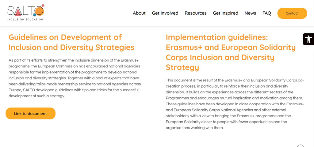
The link text should describe the content of the link target. Avoid using ‘click here’ or ‘read more’. In the link text indicate relevant information about the link target, such as document type and size or the full name of the page to which the user will be redirected, (e.g. Guidelines on Development of Inclusion and Diversity Strategies (PDF, 2 MB) or SALTO Resource Centre for Inclusion and Diversity in Education and Training).
TIP: Avoid links that open a new tab or window. Opening new links in the same tab or window makes websites easier to navigate, providing consistent and predictable experiences for all users, including those with differing abilities who rely on assistive technologies. This approach also gives users better control over their browsing and prevents confusion, especially on mobile devices. If necessary, provide an indication of the behaviour, e.g., use icon ( ![]() ) or simply add Link will open in new tab.
) or simply add Link will open in new tab.
WHAT?
A button can be in the form of an image or a text box and it provides the users with the opportunity to engage with your site. It can be designed in different sizes, colours and shapes. An icon is a graphical symbol that represents entities, concepts or actions, making it easier for web users to navigate the internet.
WHY?
Persons who are blind or with low vision rely on their familiarity with functions on the website while using screen readers. Because of that, if the labels, names and alternative texts are not the same, the site will be more difficult to use. Also, this feature is important for people with diverse cognitive abilities because it can reduce cognitive load and make the site easier to use and less confusing.
HOW?
Keep all identification consistent across website (e.g., use the same icon of magnifying glass across your website for “search” function or the button of same size, colour and shape for downloading a publication).

WHAT?
Instructions on the web pages explain how to access specific external site content or content on the same site, but with a different web address (e.g., articles, registration forms, tools etc.).
WHY?
Persons who are blind or with low vision cannot perceive shape or size or use information about spatial location or orientation. This is due to the nature of the assistive technologies they use.
HOW?
Instructions should rely on the ability not only to perceive shape, size, visual location, orientation or sound. Think of multiple ways to perceive them.
TIP: Instead of Enter your first name in the box use Please fill in your first name in the text box marked ‘First Name’ at the top of the page, just below the title.
Download
You can download the PDF version of the tool to your device by clicking button below.
